Building the scaffolding for a growing system
Design system, UI
Prologue
Before Series A we were a small team and I was handling product design single handedly along with 3 developers. We were iterating and didn’t want a system to restrict us from any creative freedom with respect to the variety of product we were building in the consumer social space. But things changed post funding as our team size started growing. Especially in the design and development side.
Business pain points
Team Size: With an increased team size of 8 full-time devs, 5-8 interns across web and android, 3 full-time designers, 2 design interns we realised that its the right time to introduce a design system in place to avoid inconsistencies in the design and development process, especially with the young interns working with us.
Pace: Unlike before, where we wanted pace in design style owing to the experimental nature of the products itself, we wanted more freedom to explore different creative styles. But now that we were doubling down to build SSUP - a product in the creator economy space, we saw a clear benefit in defining a system with which we can experiment several features inside the product with minimum development time. At this point we wouldn’t want devs to keep building the same button/input fields and the rest every single time, or even to spend an unwise amount of time to change few parameters across all the places where a particular component is used.
Role
I collaborated on this project along with my company’s founder (Sagar Modi), design lead (Aastha Mitthal), product manager (Aakash Verma), android team lead (Mukesh Solanki) and web team lead (Kushagra Agrawal). I was responsible for guiding the design interns to procure some preliminary user survey on style preferences, researching on the ideal model and hierarchy for our design system after multiple discussions with all the stake holders, building publishable components on Figma while also fixing and letting the system grow as per need.
Setting things up
Preliminary User Survey
As a team we didn’t spend a lot of time deep diving into the brand style and identity because we were honestly prioritising rapid iterations on product until we hit PMF. I decided to take help from our design interns to execute a small survey with a group of 50-100 college students who’d be our ideal user group. We wanted to get a sense of their taste/preference in app UI. They were asked about their preferences on light vs dark mode, font styles, colours, icons, graphics, etc using a multiple choice format questionnaire on Google forms.
The results of this survey guided us to make a more informed choice on the style of our product.
We were also aware that a good proportion of the audience we were targeting were gaming stream viewers and they were heavily invested in platforms like twitch & discord. We wanted to be somewhere in that space for these users to leverage on the familiarity.
System model
During this time I was primarily understanding the common practices with regards to the design and development of well established design systems like Atlassian, Google M3, Apple HIG, etc as well as checking out how startups like Urban company and others were using their own simplified custom models.
I was able to figure out the pros and cons of each and why it makes sense for them and why certain decisions made in those model would not work for us.
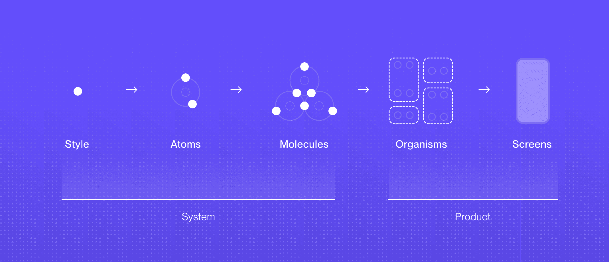
With regards to the hierarchy Brad Frost’s Atomic model for design system is quite well known in the industry and seemed helpful for the system we were building.
Design tokens
I experimented with design system considering it’d be great to have a single source of truth for all the design files and the one in development. Besides that, having multi-level abstractions in a system seemed useful.
But we collectively decided to skip design tokens for the following reasons:
Lack of first party support for token system and less community support we decided to skip tokenisation after discussing with all the stakeholders.
While multi-level abstractions can be useful, finding the right balance and giving enough thought to the abstraction structure was very important. Without it we could be spending to much time in over engineering a complex system when its not really needed.
Analysing MVP PRD
This was important to understand what would be the components required to ship the first version of the app.
I developed wireframes of all these screens
This of course helped me scope out all the styles, atoms & molecules I have to build but also helped me gauge better on the variants and hierarchy I’ll need.
Building the style
Colors
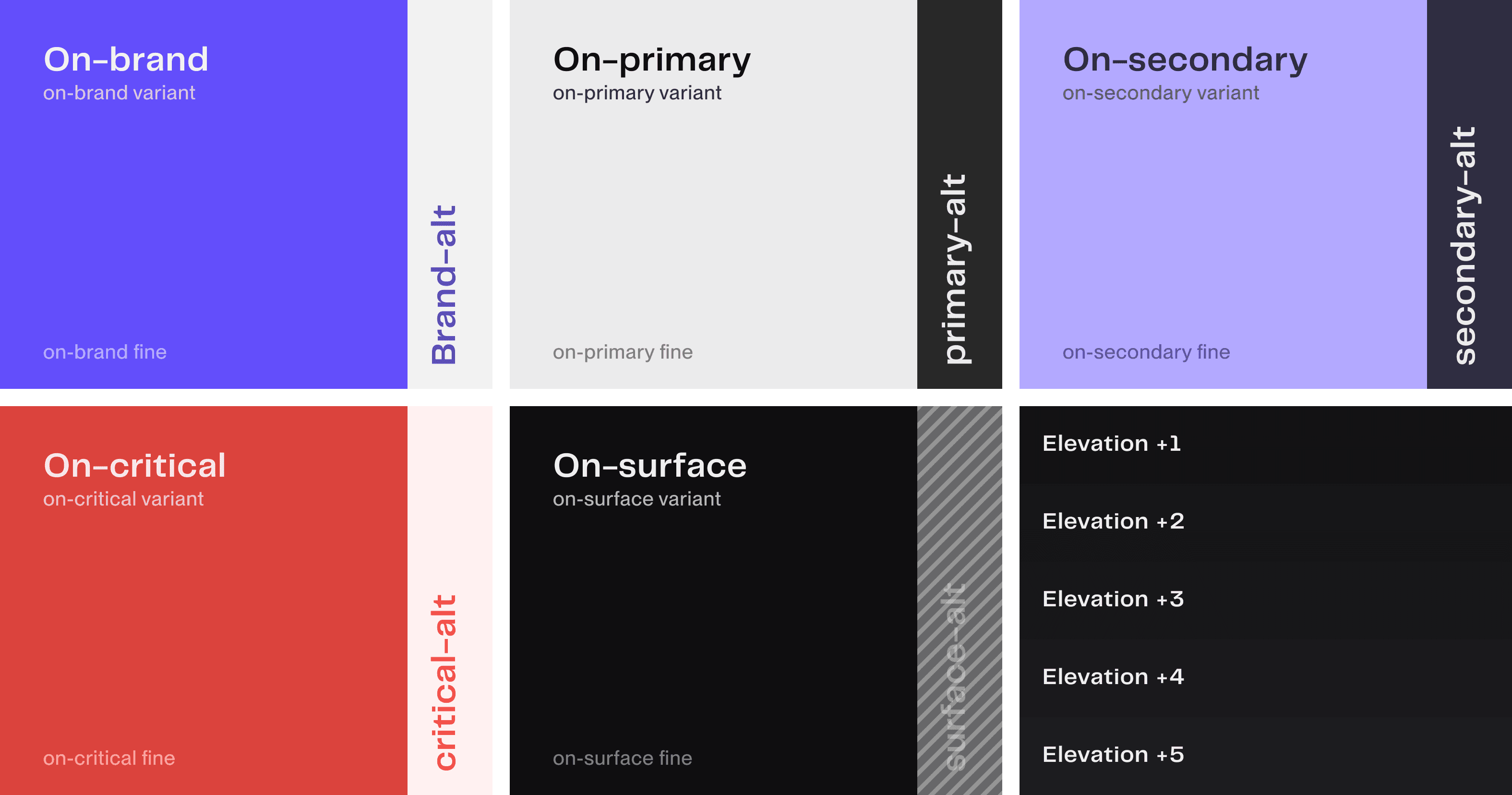
For the primary palettes the sub-divisions were the following
{colour}: This would be the base colour
on-{colour}: Colour of any text or icon that goes on top of a surface that uses {colour} as fill.
on-{colour} variant: Colour of any text or icon which needs less emphasis than on-{colour}
on-{colour} fine: Colour of any text or icon which needs less emphasis than on-{colour} variant
This structure made sure that we have enough hierarchy that we can utilise within any of the core colours. Colours like blacks and whites were carefully picked so that they don’t create extreme contrast for viewers as this can be tire the eye easily.
Surface colors
The surface category of colours are for the base colour of the app and elevations for cards or buttons that come on top of the surface. Based on Android’s M3 guideline the closer a card elevation is, the lighter its surface colour will be.
Custom colors
This bucket was available specifically for custom buttons and components that are not part of the core app components. All the stakeholders were aligned on not using any #hex-code directly in code to avoid redundant colours and human error. There has to be at least one level of abstraction on all the colours used in the app. The custom colours section enabled for the same.

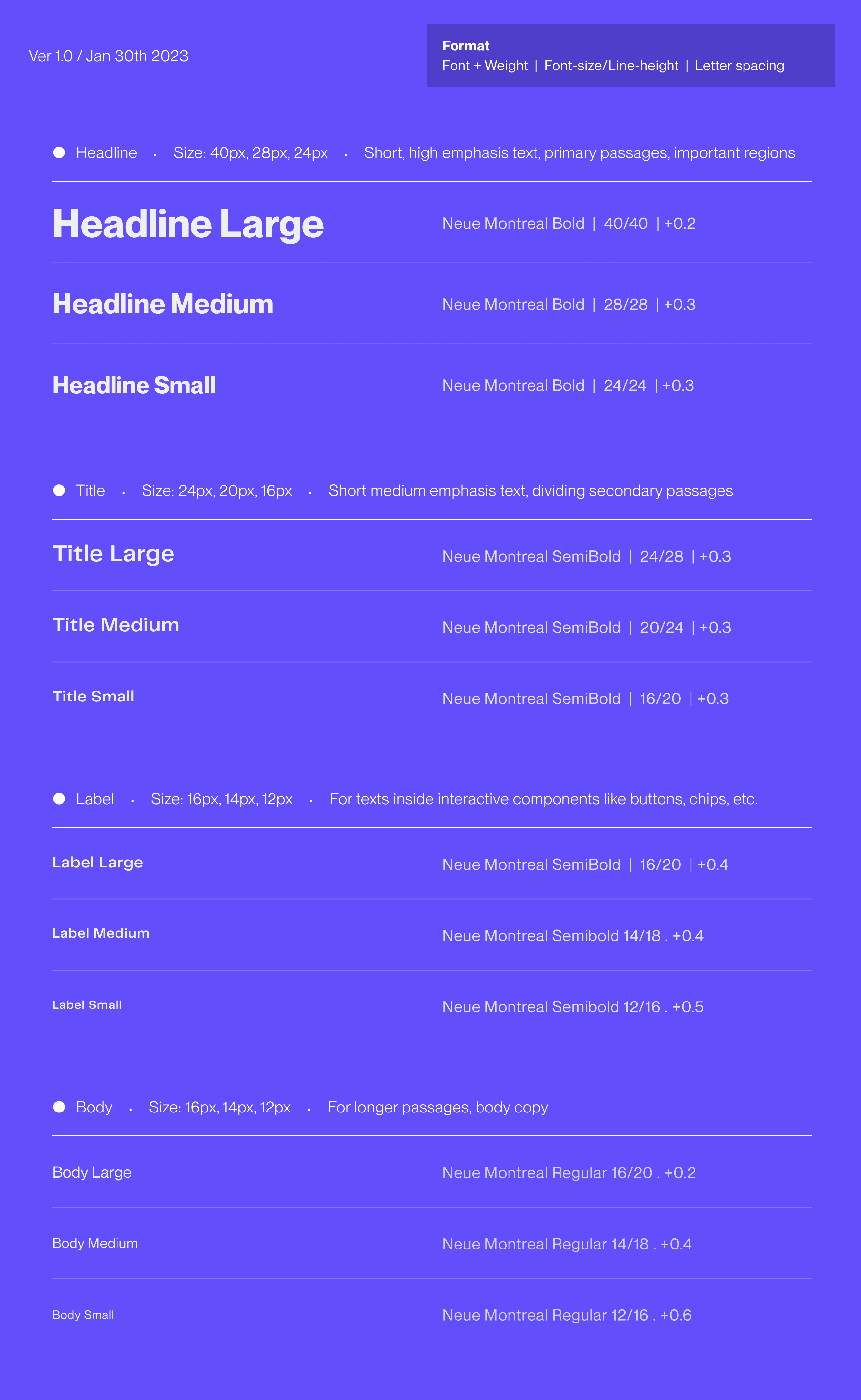
Type
While I maintained the Android’s type system structure, I modified the parameters to remove redundant sizes. Headline large & medium were primarily allocated for desktop UI’s whereas the rest of them were shared across Android and web desktop platform.
Icon system
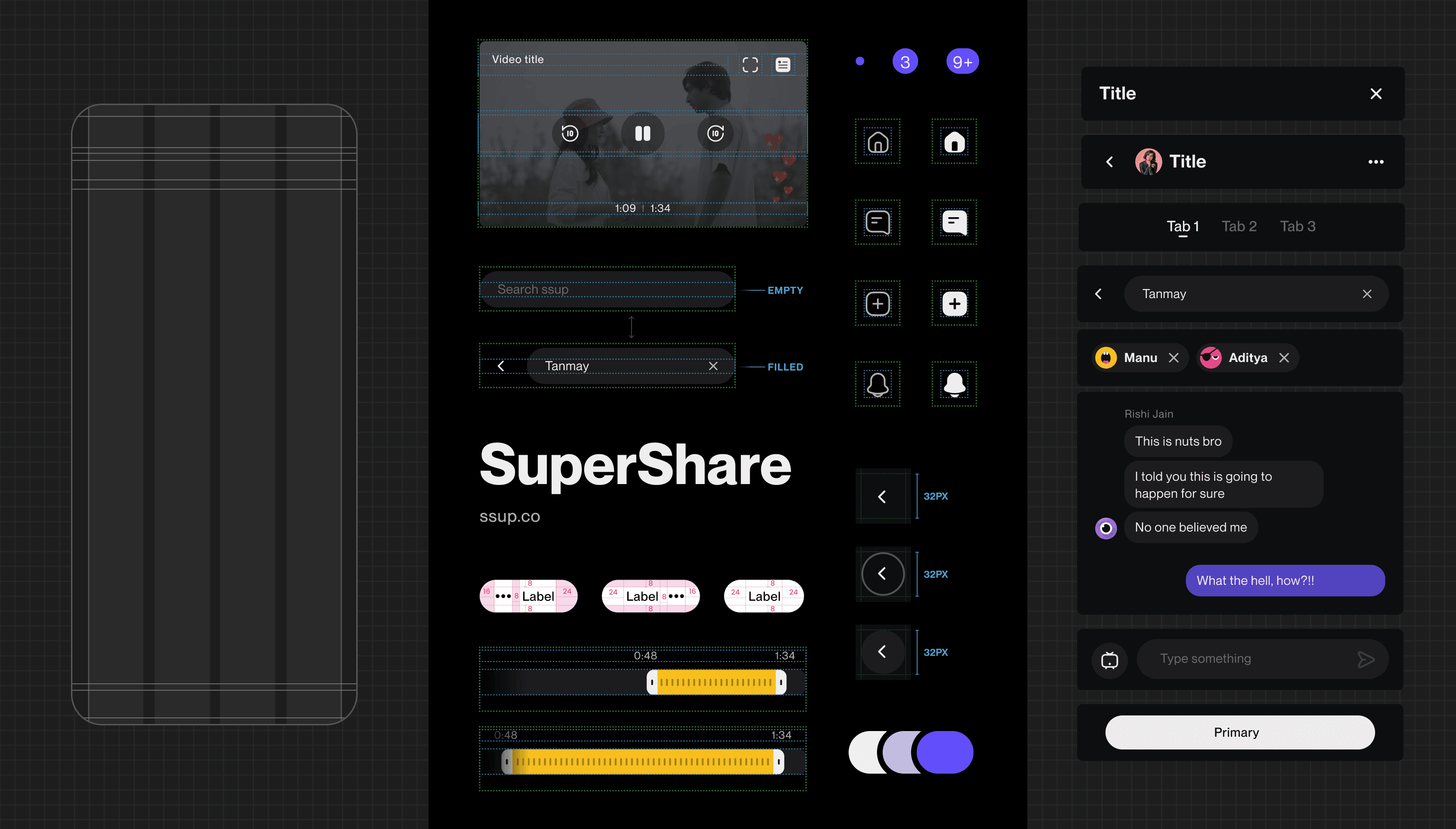
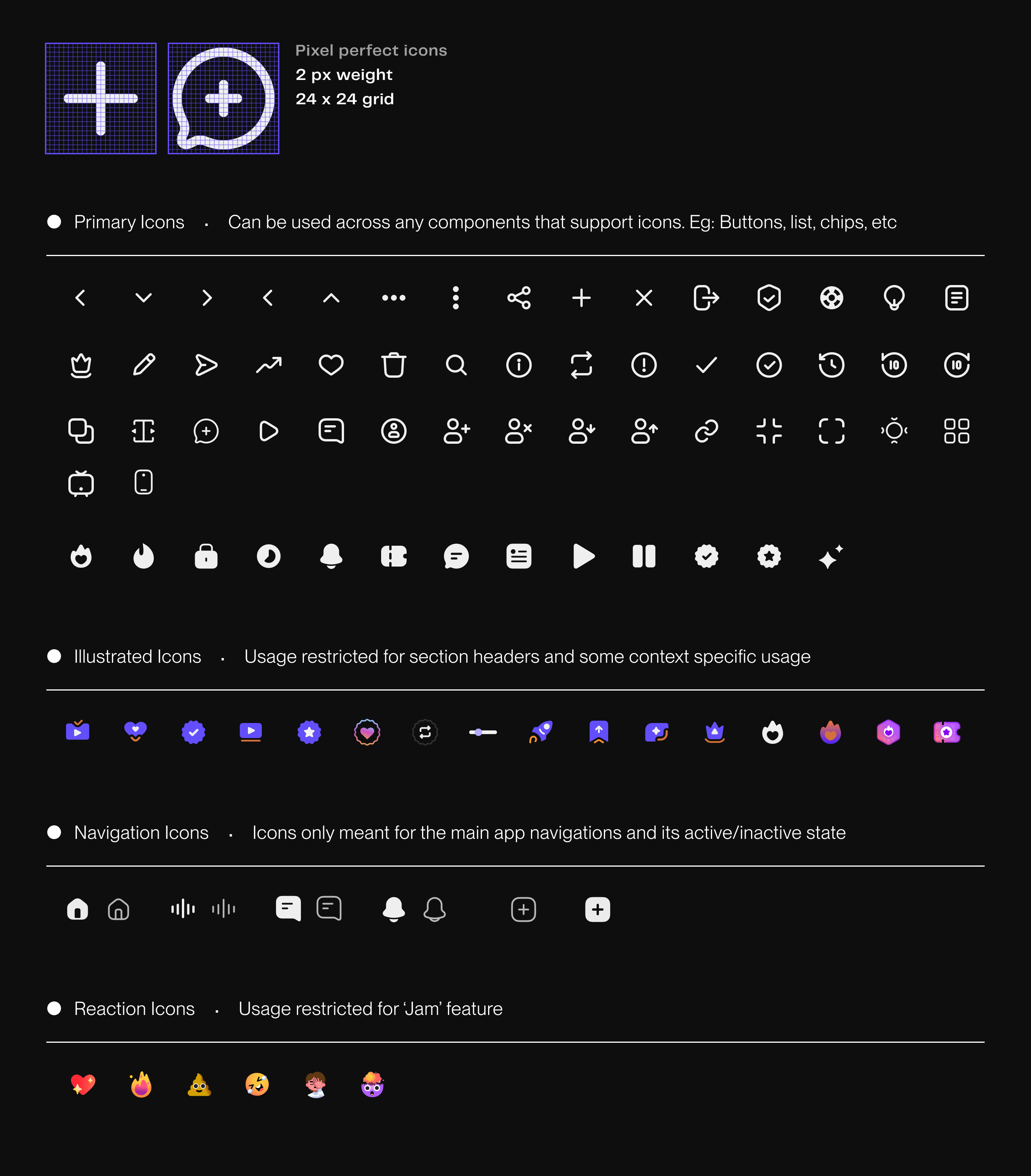
The icons we designed for the app were based on a 24x24 pixel perfect grid layout with a 2px stroke with for the line variant. I made sure that the core parameters like curvatures, stroke end caps, negative spaces, etc were the same so that they feel like it comes from the same family.
Apart from the main icons we also had a different bucket of illustrated icons being used to make the app a bit more friendly and fun. Icons used for the navigation sections were kept in a separate bucket with an active and inactive state of each. Logo variants were also included in the icon bucket for better consistency
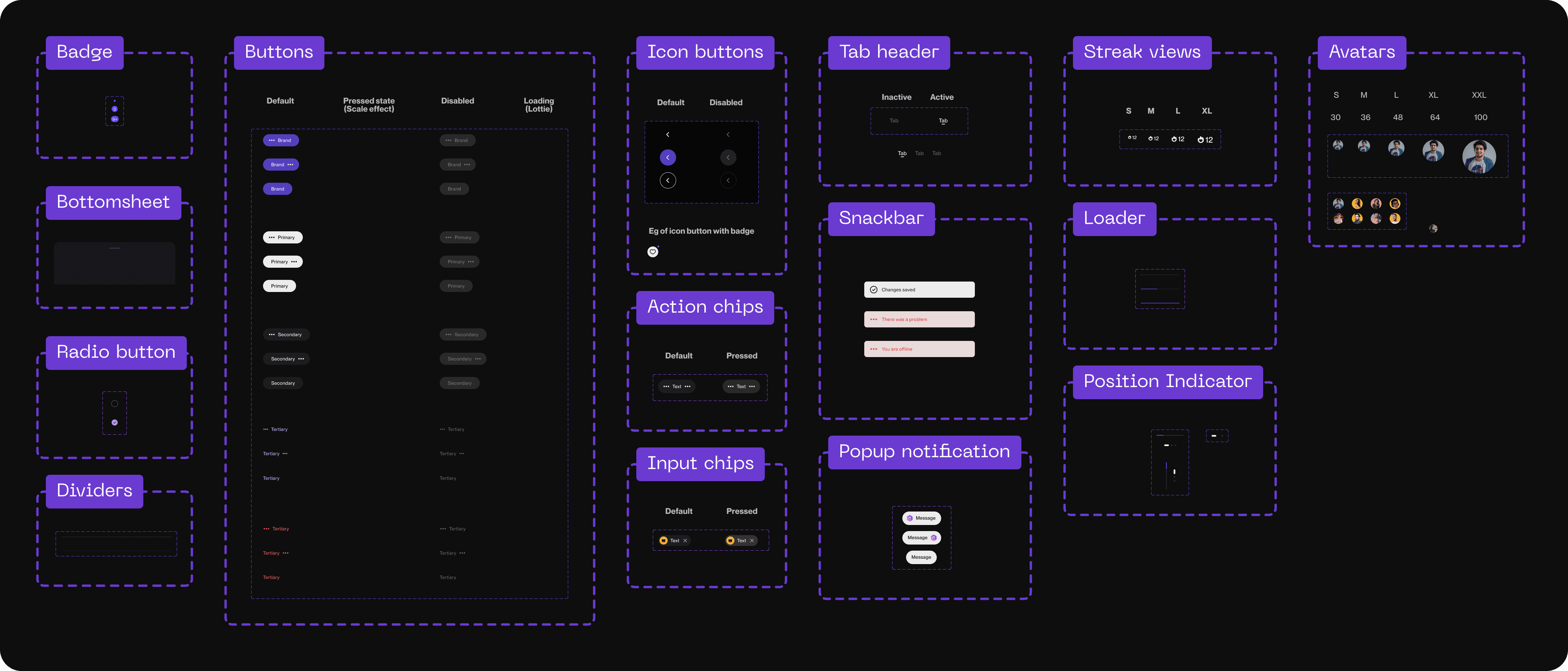
Atoms
Atoms were essentially small crucial components that were built using the rules defined in the style system I developed. This would contain elements like buttons, badges, avatars, snack-bars, etc.
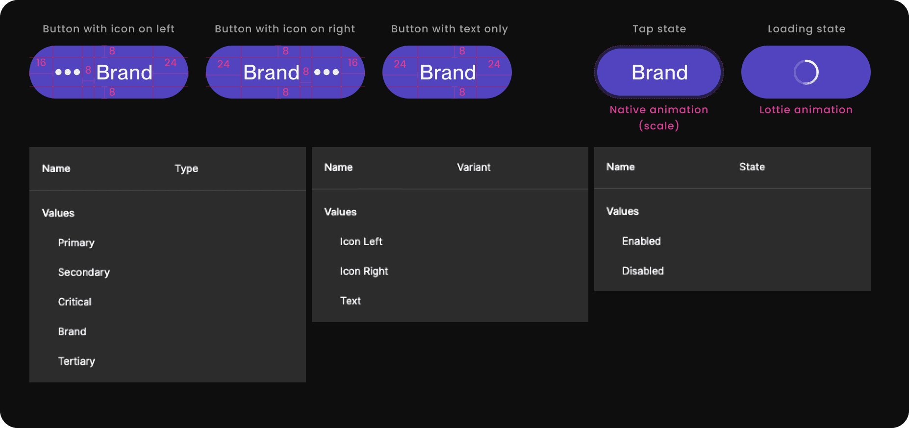
Buttons
All the components were made strictly using auto-layout for design to development consistency and scalable usage for everyone building screens with these components. This also helped me seamlessly integrate multiple states inside one single component.
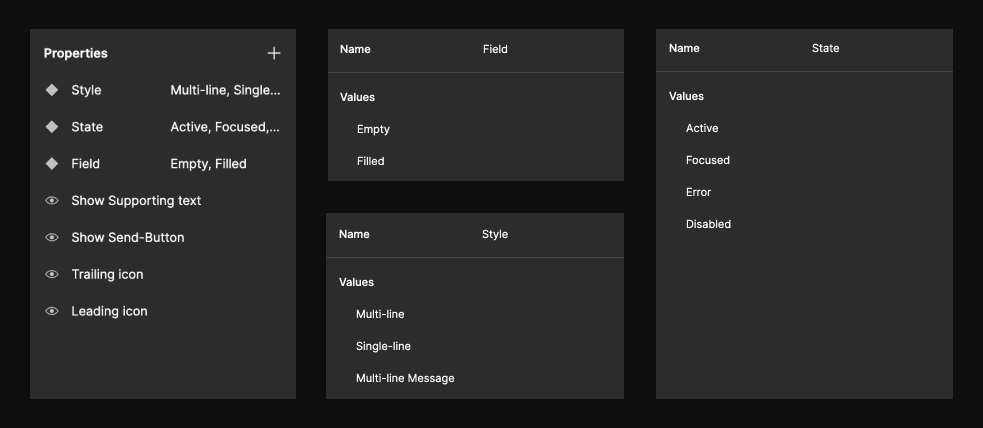
Molecules
Molecules were more complex components compiled with multiple atoms and rules within the core style system.
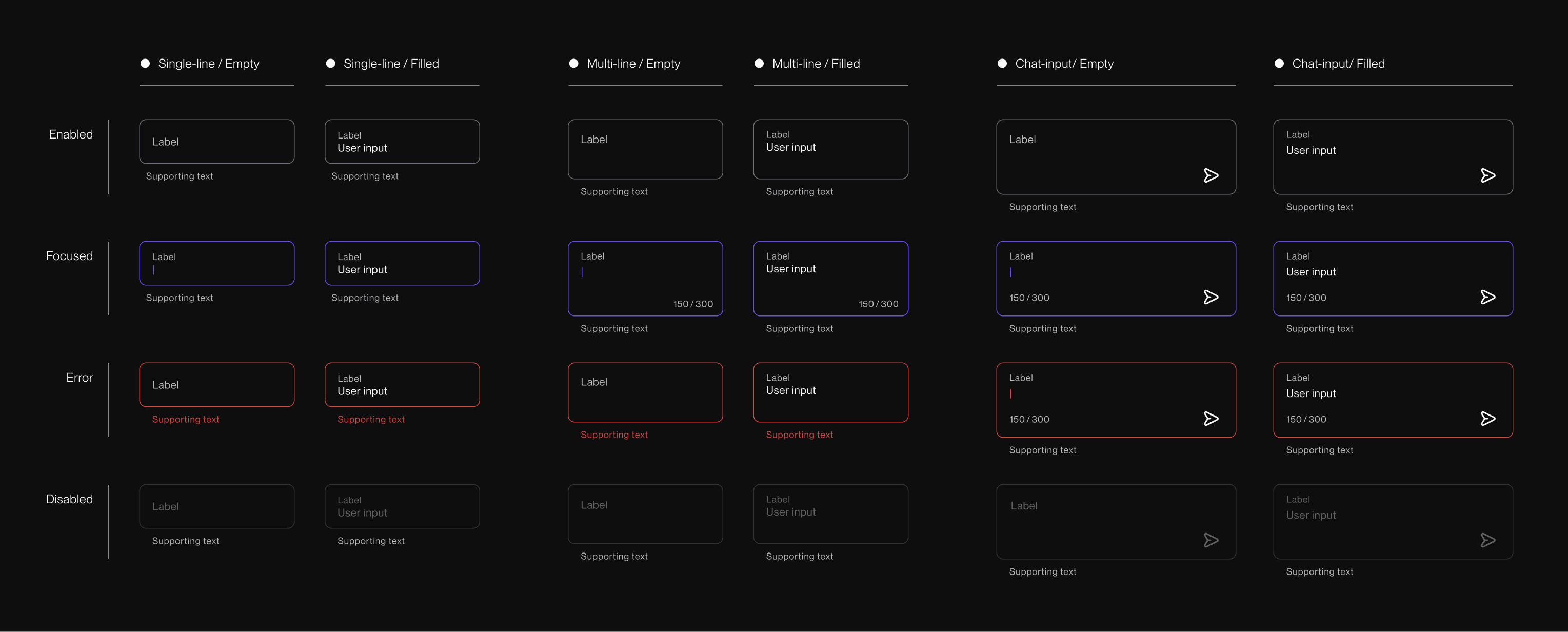
Text field
All the components were made strictly using auto-layout for design to development consistency and scalable usage for everyone building screens with these components. This also helped me seamlessly integrate multiple states inside one single component.
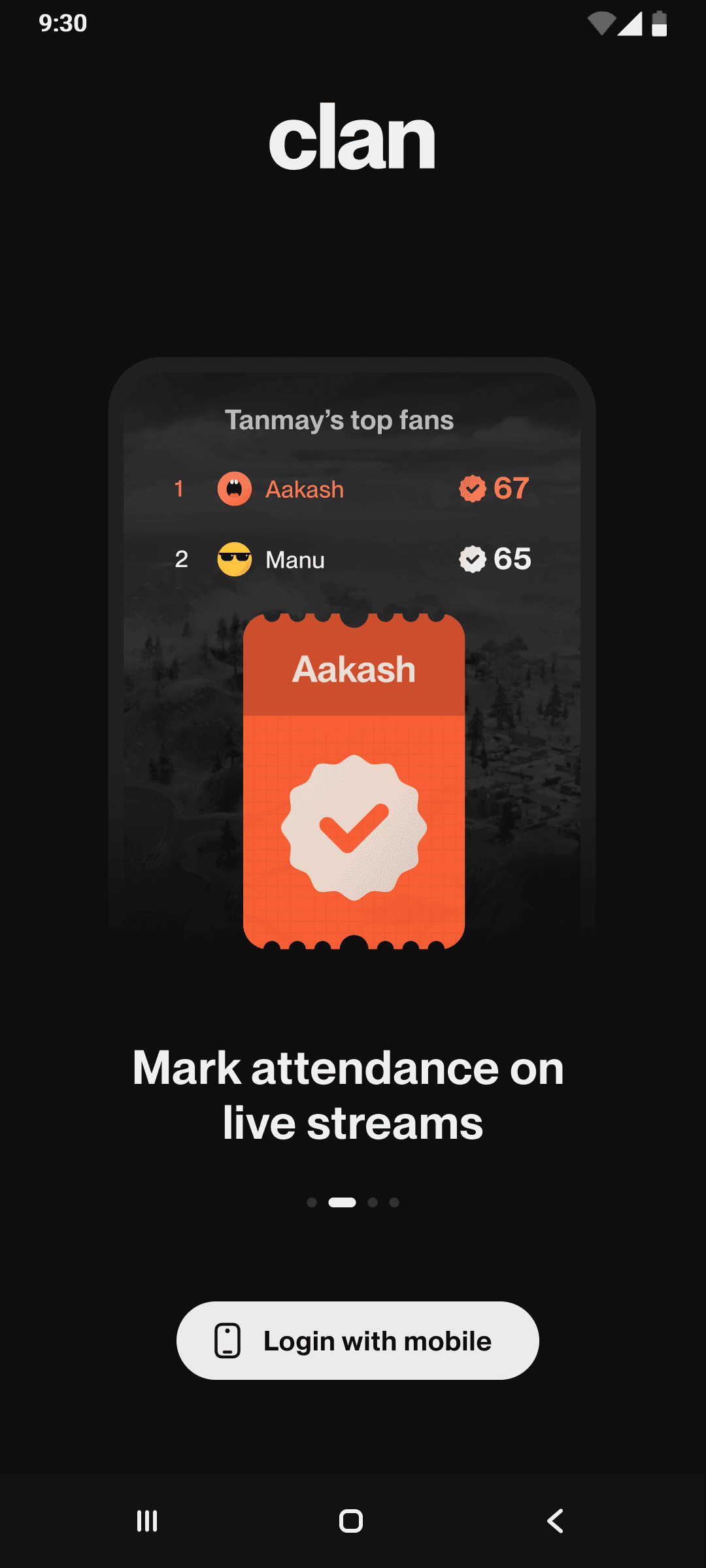
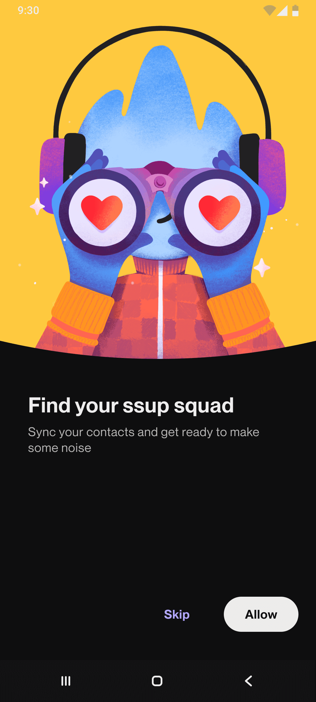
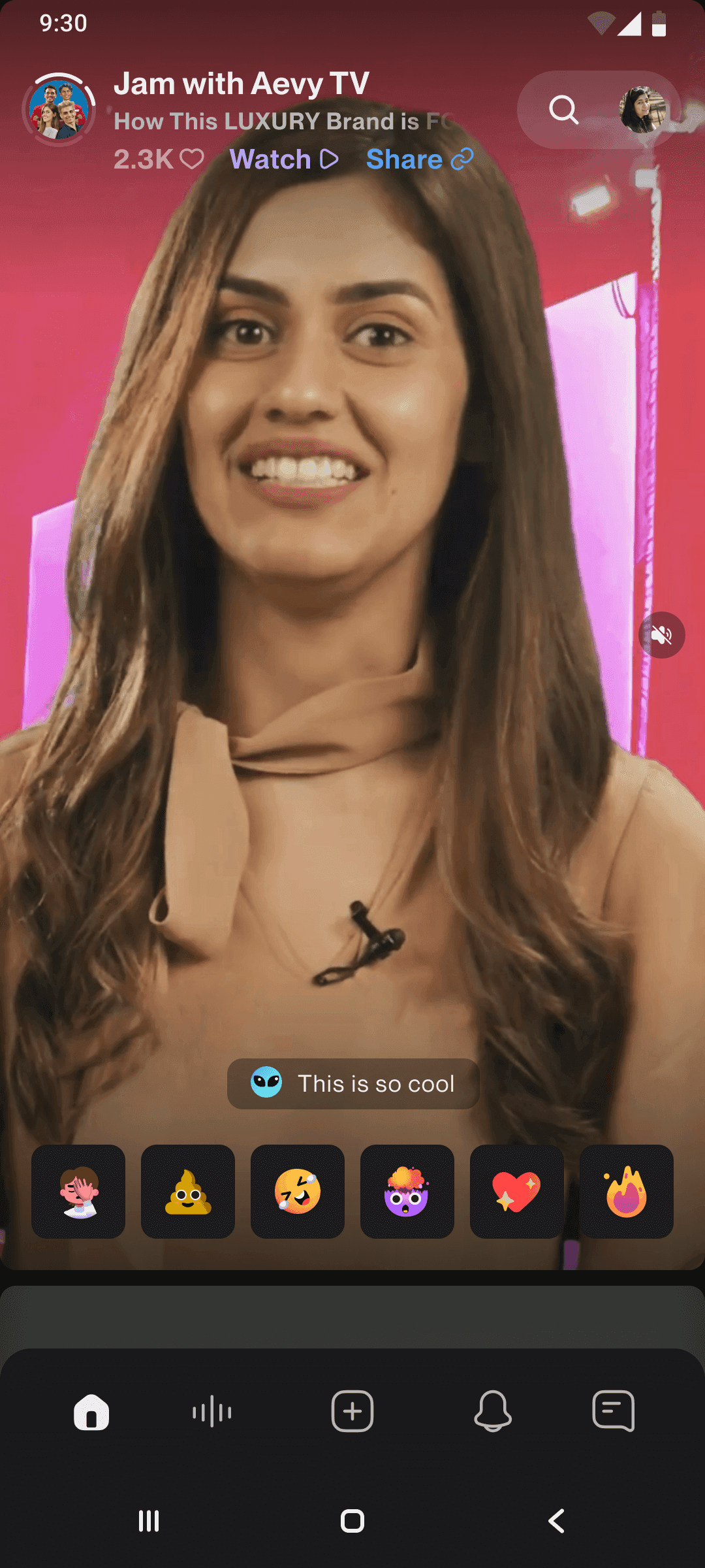
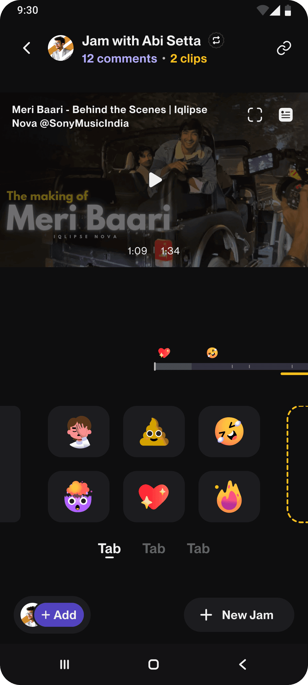
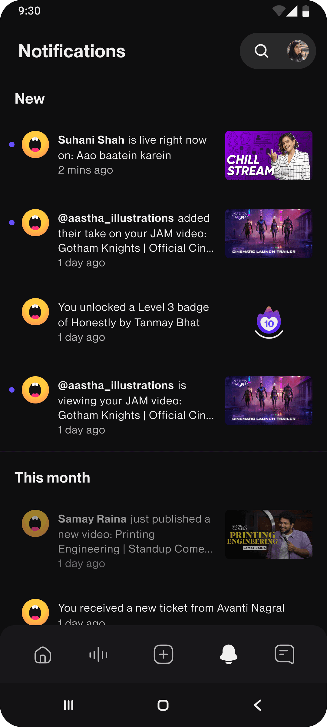
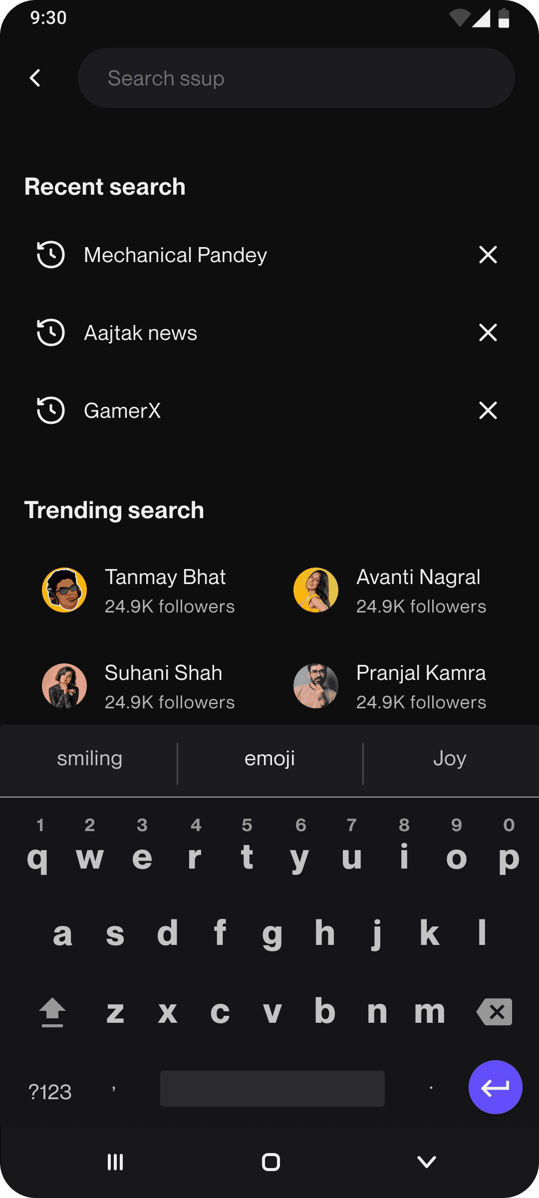
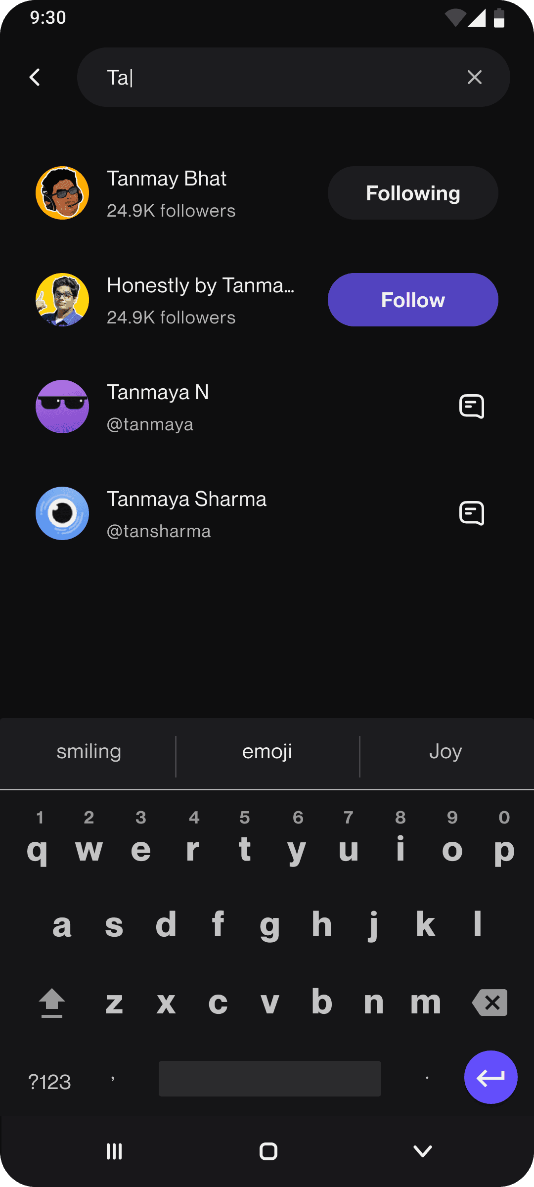
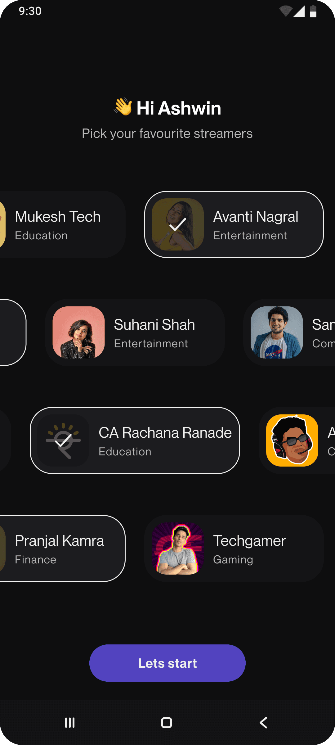
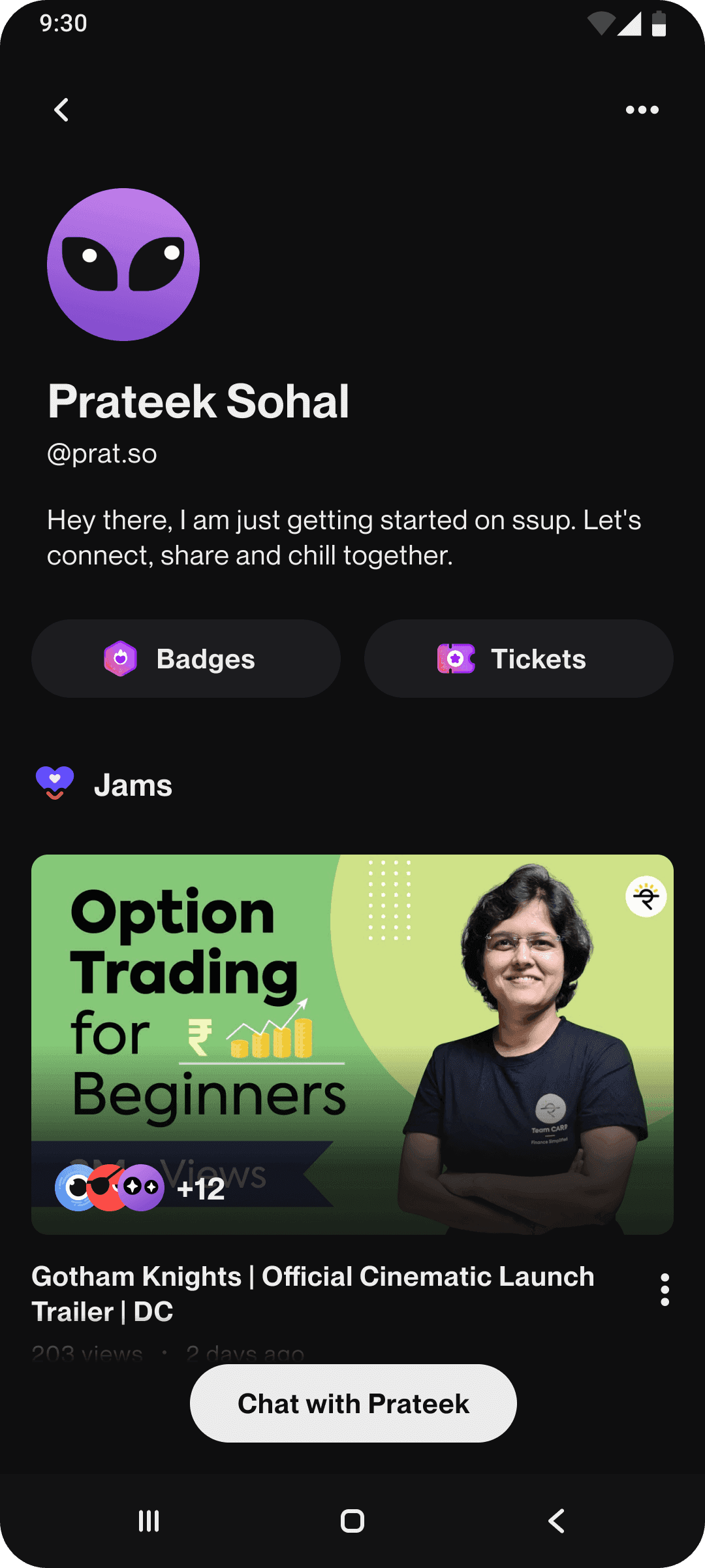
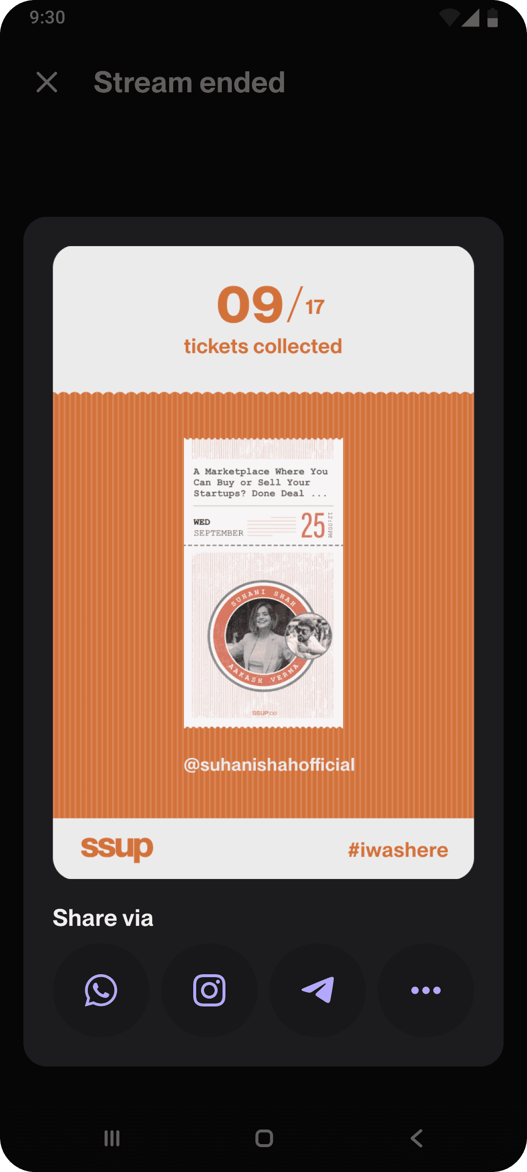
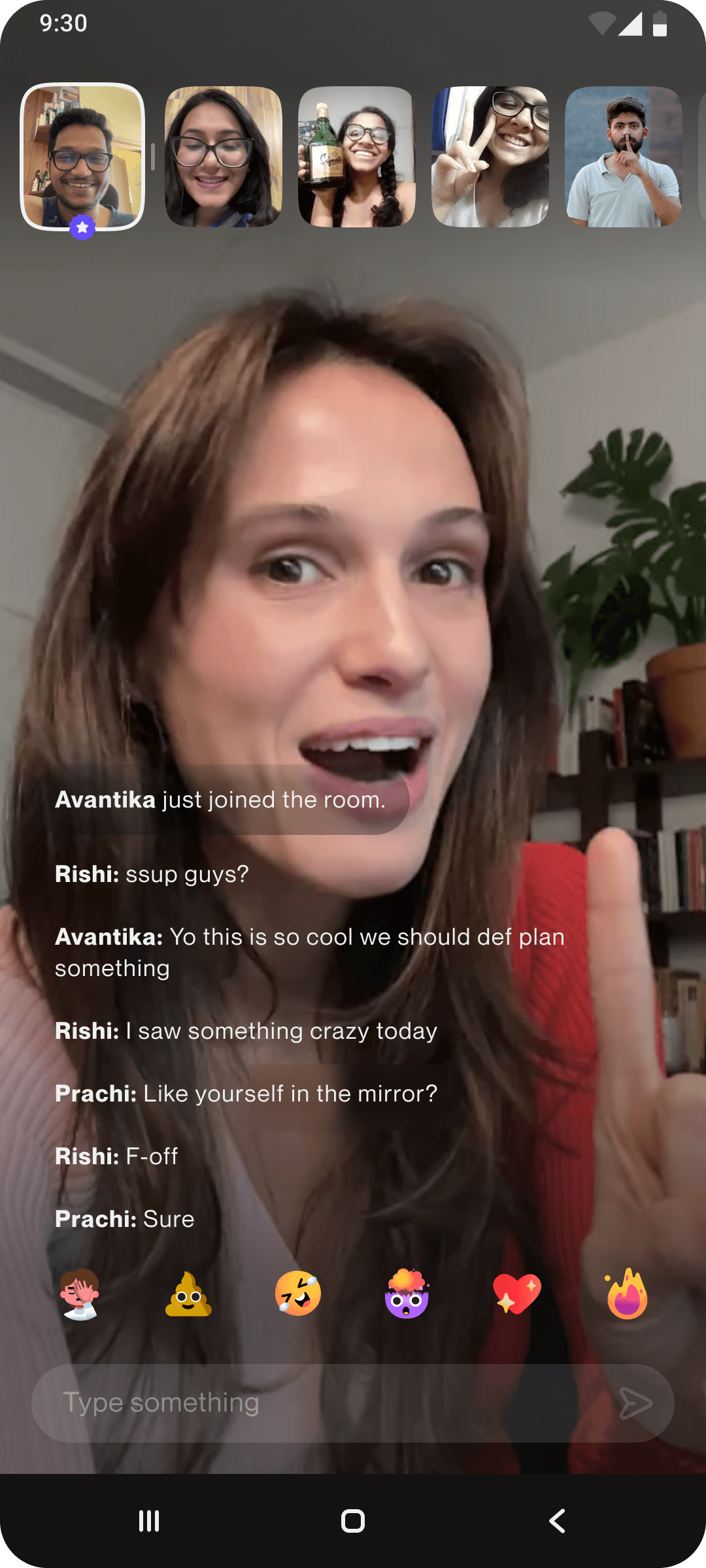
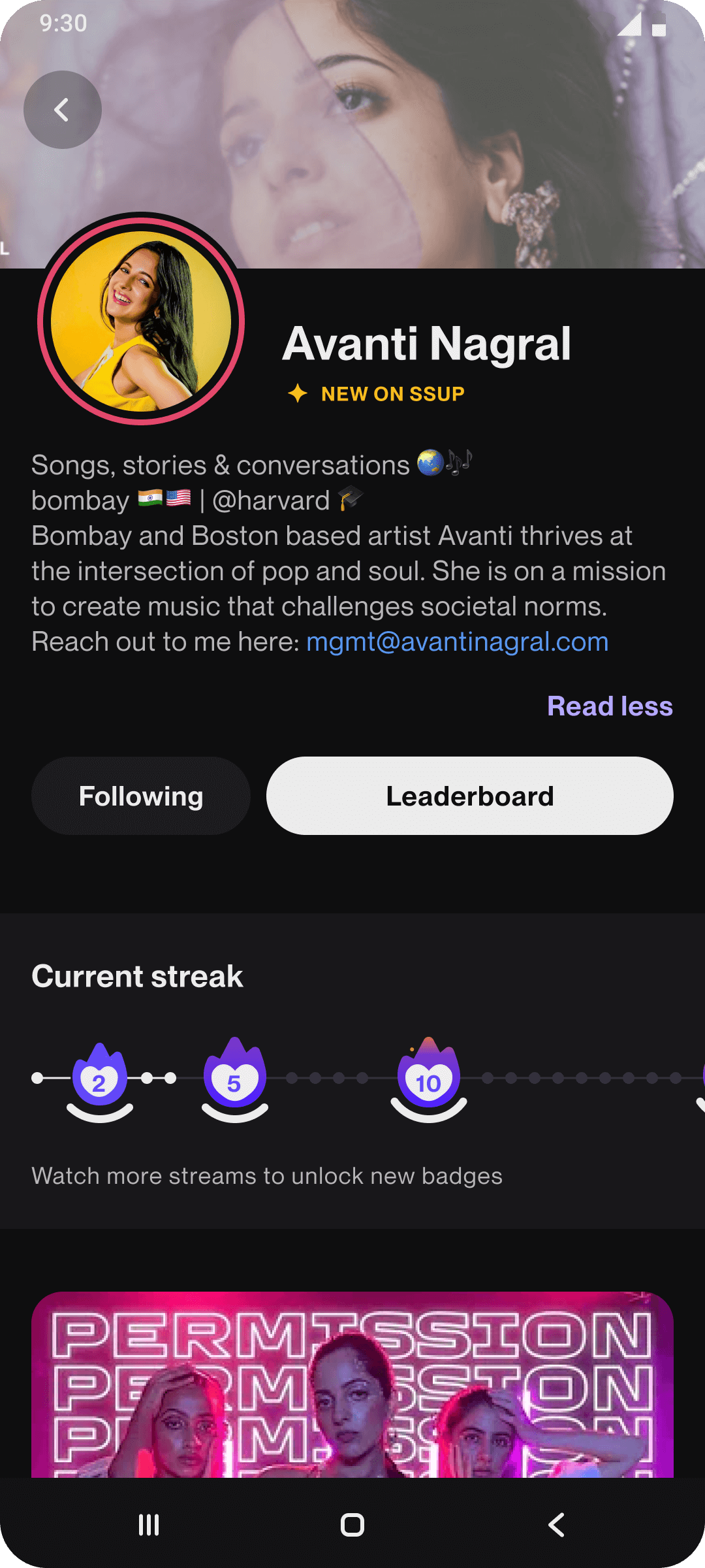
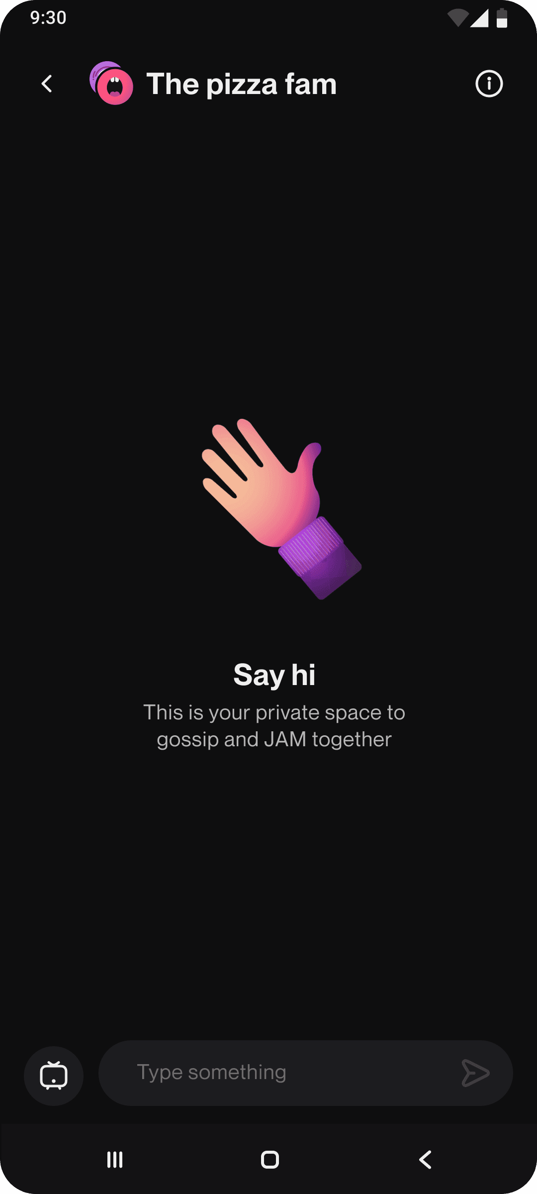
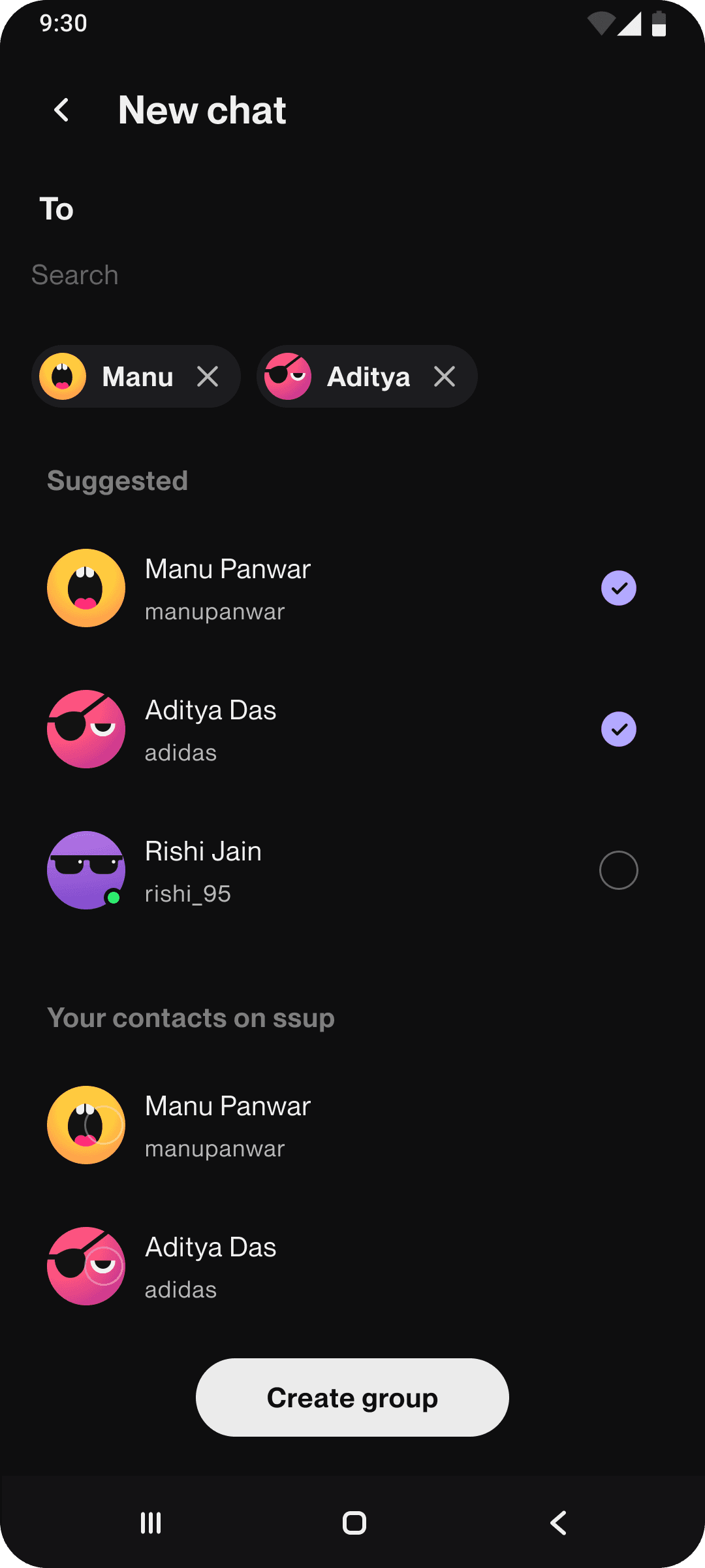
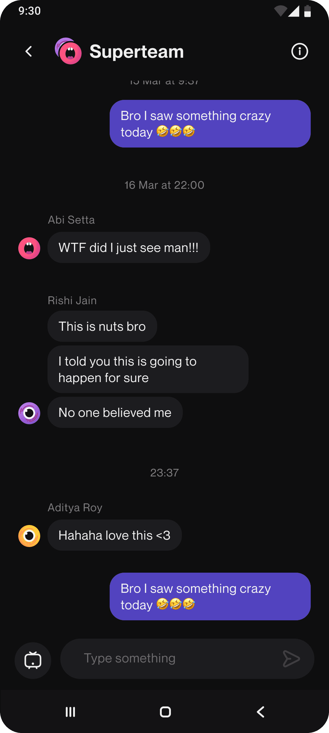
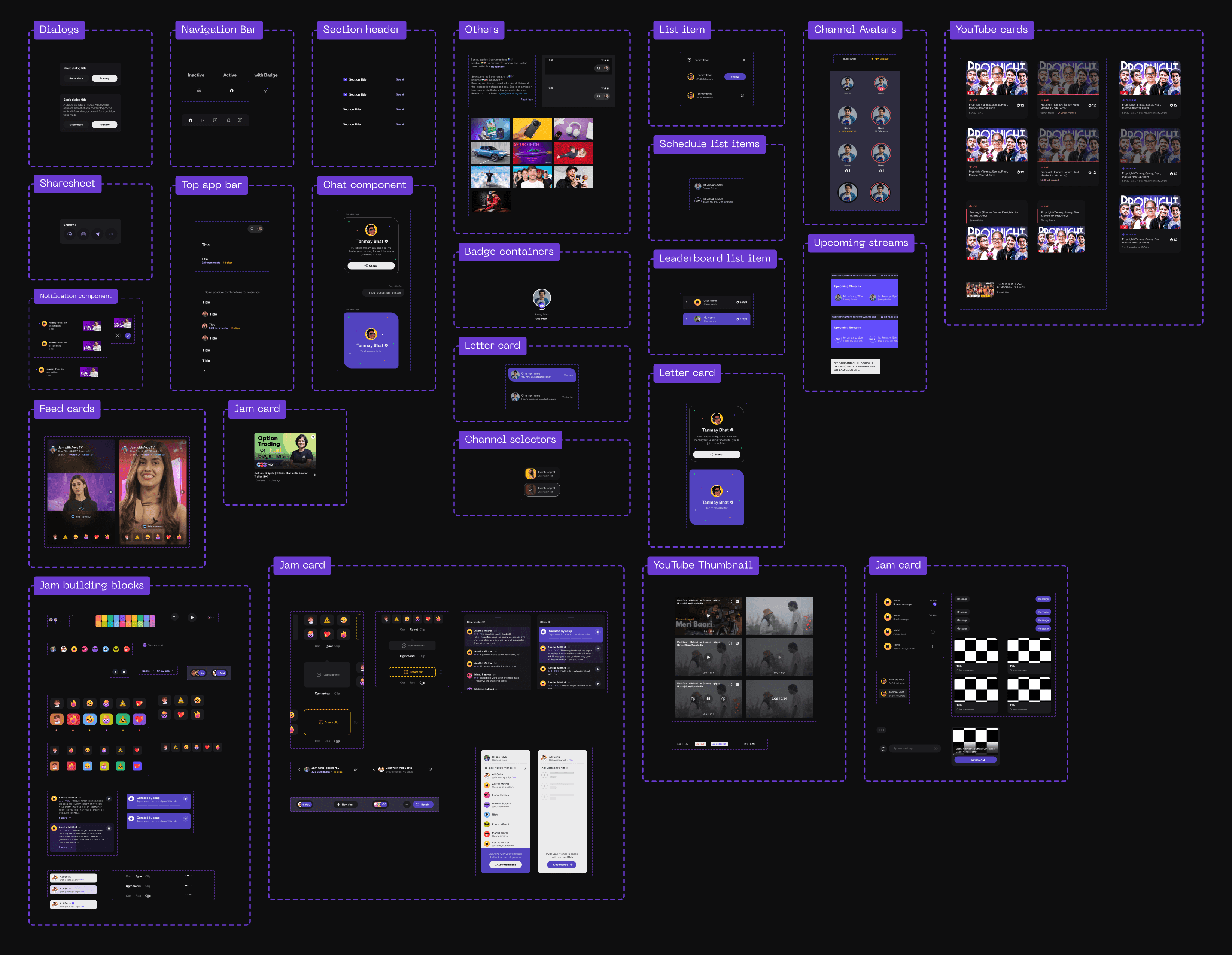
Designs in action
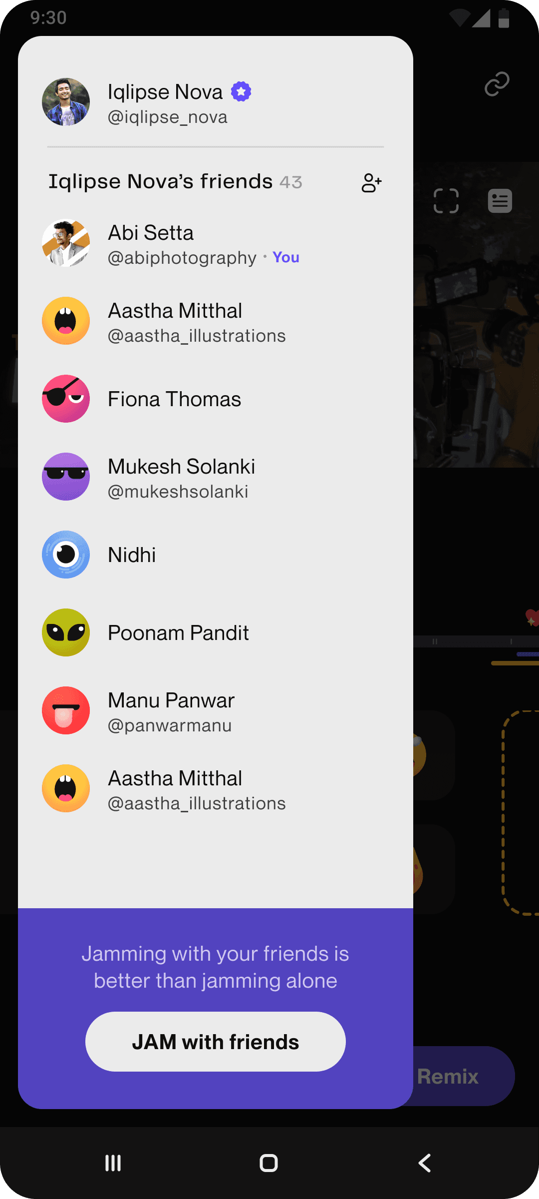
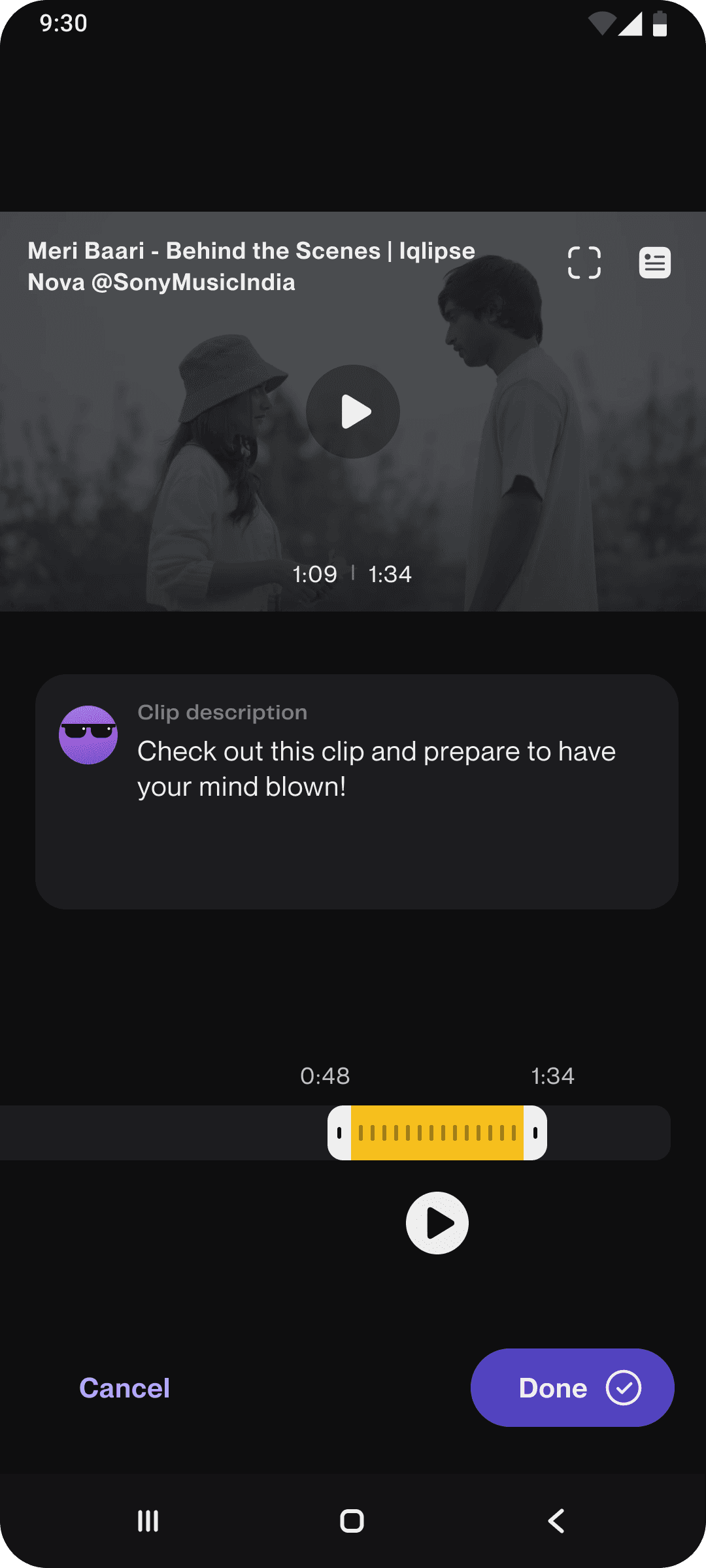
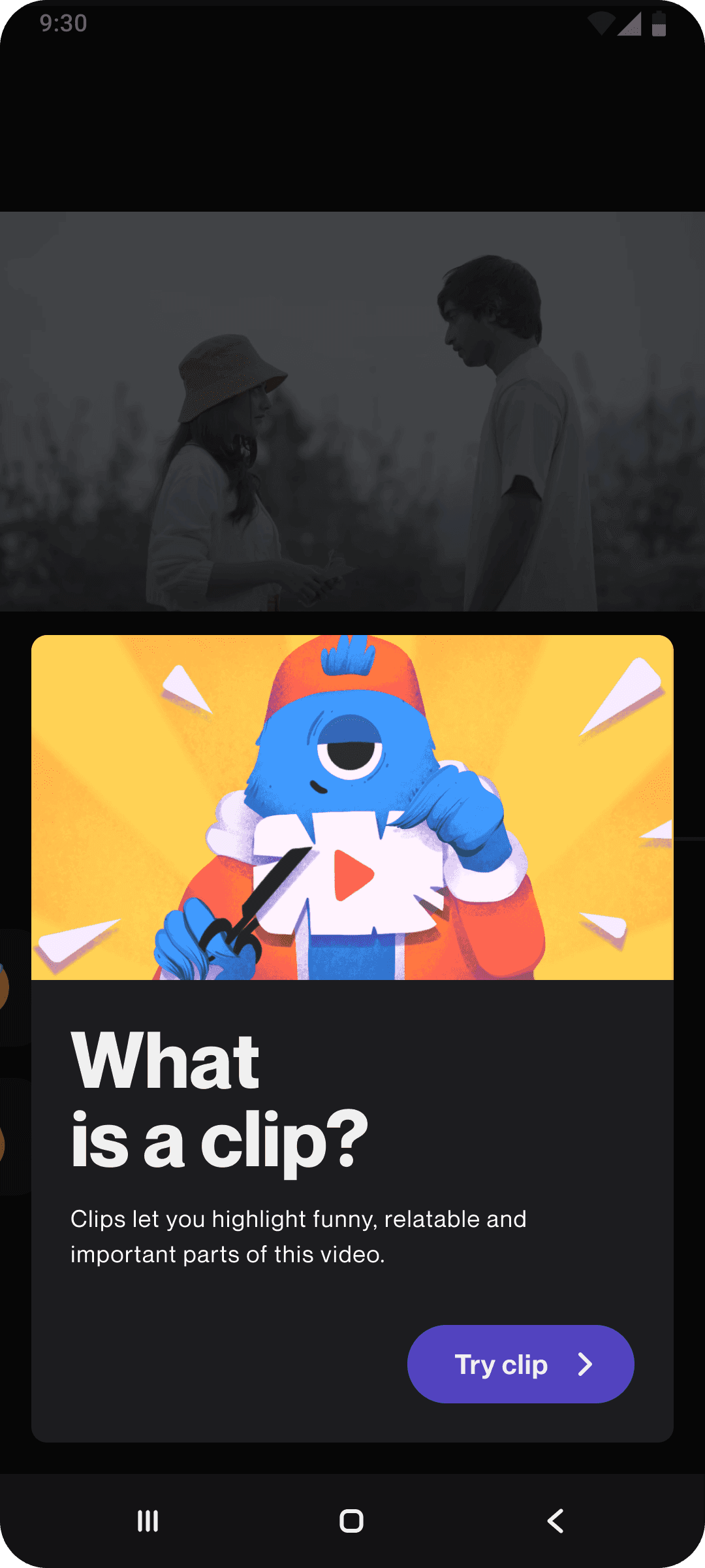
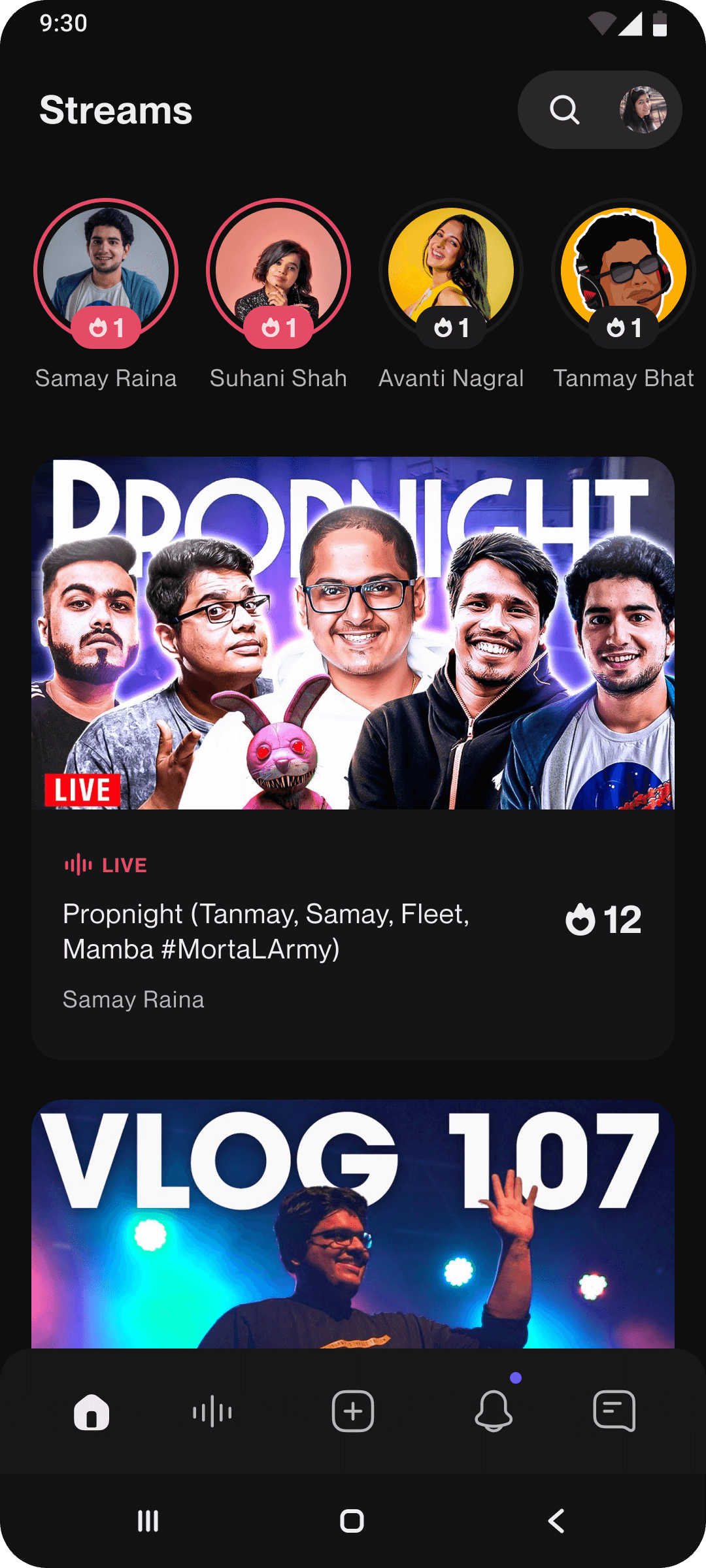
A curation of screens from across the timeline since we built SuperBlocks.